Making minor style changes is simple once you understand the underlying structure. Every theme and plugin is different and Strong Testimonials is no exception.
This quick guide is meant to point you in the right direction. It is not a comprehensive style guide or CSS course. It assumes you have a basic understanding of HTML and CSS or are at least willing to try. WordPress does require certain bravery. 😉
Terminology
Let’s get our terms straight.
selector {
    property: value;
}
A rule set (also called a rule) consists of a selector followed by a declaration block.
A declaration block starts with a left curly brace and ends with the matching right curly brace.
A declaration consists of a property name, followed by a colon, followed by a value.
Terms
First, let’s get our terms straight. Here is the general CSS syntax:
selector {
    property: value;
}
A selector can be any HTML element. Class selectors are used extensively. For example:
.testimonial {
    text-align: left;
    border: 1px solid #E6E6E6;
}
That selects any element that has been assigned the class name “testimonial” like this:
<div class="testimonial">Multiple Classes
Frequently, multiple classes are used to narrow down the selection. For example:
/* no space in between = find elements with both classes */
.centered.full-width {
    text-align: centered;
    width: 100%;
}
<div class="centered full-width">Child Elements
Multiple classes are also used to select child elements. For example:
/* a space in between = parent and child */
.content .section {
    padding: 1em;
    margin: 1em;
}
<div class="content">
<div class="section">
…
</div>
</div>See how the CSS and HTML connect?
Try these great resources for learning more:
- CSS Syntax on Tutorials Point
- What is a rule or “rule set”? on Selectutorial
- CSS: An Overview on Codecademy
Elements
In order to allow multiple templates on the same page, the template name is added to the main container as a CSS class. Also, the view ID is added. For example, here’s the container in the default template:
<div class="strong-view default strong-view-id-1">
The template names (as of version 2.30):
| Template | CSS Selector For The Container |
|---|---|
| Default | .strong-view.default |
| Default + dark theme option | .strong-view.default.dark |
| Default + image on right option | .strong-view.default.image-right |
| Default + no quote symbol option | .strong-view.default.no-quotes |
| Bold | .strong-view.bold |
| Modern | .strong-view.modern |
| Simple | .strong-view.simple |
| Small Widget | .strong-view.small-widget |
| Small Widget + image on right option | .strong-view.small-widget.image-right |
| Unstyled | .strong-view.unstyled |
The elements in cascading order:
| Element | CSS Selector |
|---|---|
| Content wrapper | .strong-content |
| Individual testimonial | .testimonial |
| Inner box | .testimonial-inner |
| Heading | .testimonial-heading |
| Content | .testimonial-content |
| Featured image | .testimonial-image |
| Client box | .testimonial-client |
| Client name | .testimonial-name |
| Client company | .testimonial-company |
| Read more | .readmore |
The following examples will make this clear.
Class Names
Assemble the class names
Depending on what property (border, background, margin, etc.) you’re trying to style, a single class may work for some elements.
.testimonial-client {
    font-style: italic;
}
For most elements, you will also need to use the container class names in order to be more specific.
Not specific enough to override:
.testimonial {
    border: none;
}
Still not specific enough to override:
.strong-view .testimonial {
    border: none;
}
Bingo!
.strong-view.default .testimonial {
    border: none;
}
Notes
When in doubt, be more specific.
Your theme may provide testimonials too so you may need to match or exceed its specificity.
You can change the CSS class names assigned to your custom fields in the view editor.
You can examine the template files and stylesheets directly in the plugin’s templates folder.
Browser Tools
Did you know that every major modern browser includes a tool for inspecting the source code?
Chrome Developer Tools | Firefox Developer Tools | Microsoft Edge Developer Tools
Basically, hit F12 or right-click any element and select “Inspect” to see the HTML and CSS behind it.

Where to put custom CSS code
In the Customizer
In WordPress 4.7+, use the Additional CSS section in the Customizer.
Note: Any custom CSS added in the Customizer is only available for that particular theme. To use your custom CSS in other themes, simply copy and paste it the same way for each theme.
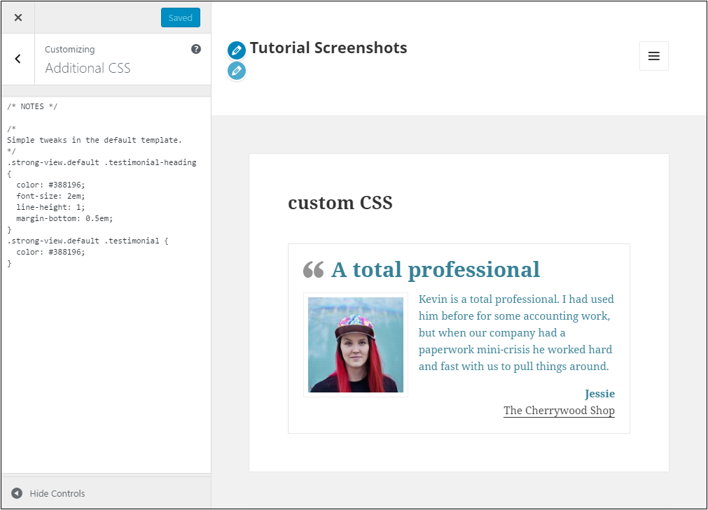
One big advantage to using the Customizer is that you will see your changes right away so you can easily dial in your CSS without saving files and flipping between browser windows.
In your theme
Some themes offer a custom CSS section too. Like the native WordPress option above, your CSS will only be available when that theme is active.
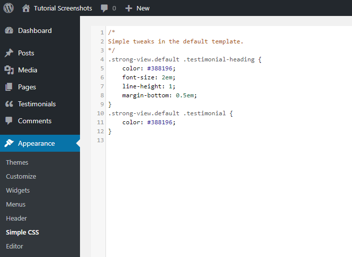
With a plugin
Try a plugin like Simple CSS for theme-agnostic changes and more room to type.
Lots of changes? Make the pro move.
Create a child theme and place your custom CSS in its stylesheet.
Child themes require a little more work upfront but offer many benefits down the road, including:
- the stylesheet can be cached, improving your site’s speed
- they are safe from being overwritten by theme updates
- they make further customization easier; for example, custom post templates
What NOT to do
Modify the plugin stylesheets. Your changes will be overwritten in the next plugin update, which are frequent.
Modify the theme stylesheet if you are using a free theme from wordpress.org or a premium theme. Your changes will be overwritten in the next theme update.
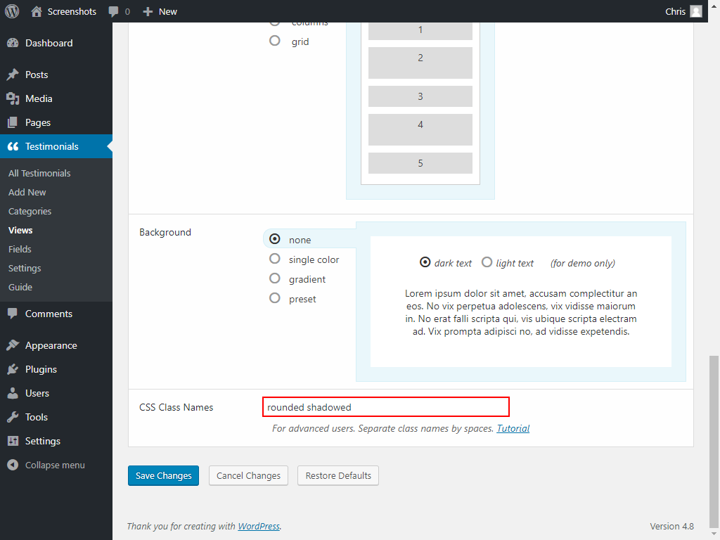
Your own classes
If you want to use the same style across multiple templates, or you prefer a bit more organization, create your own CSS classes.
For example, here are two classes named “rounded” and “shadowed”:
/* rounded */
.strong-view.rounded .testimonial {
  background: #ECF5F8;
  border-radius: 20px;
  border-color: #388196;
}
.strong-view.rounded .testimonial-inner {
  border: 0;
}
/* shadowed */
.strong-view.shadowed .testimonial {
  box-shadow: 5px 5px 15px rgba(0,0,0,0.3);
}
Then add these class name(s) to the “CSS Class Names” option in the view editor. You can also add classes that may exist in your theme. They will be added to the main strong-view container.
Results
<div class="strong-view default strong-view-id-1 rounded shadowed">
  <div class="strong-content strong-normal columns-1">
    <div class="testimonial post-1179">
      <div class="testimonial-inner">…</div>
    </div>
  </div>
</div>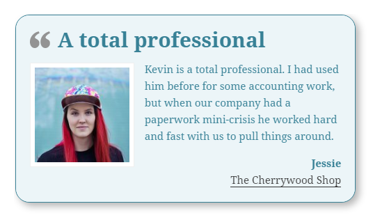
Take care of your code
Add comments
Do your future self a favor and add comments to your code so you know what the heck it does and why you put it there when you come back to tweak it 3 months or 3 years from now.
Anything in between /* and */ are comments.CSS
/* Comments can be on their own line like this. */
.widget {
    text-align: center; /* Comments can be appended to any line. */
}
You can also “comment out” CSS rules to disable them without deleting them.
By line:
.widget {
    /* text-align: center; */
}
By section:
/*
.widget {
    text-align: center;
}
*/
If you’re working with other people, consider adding your name and the date to comments so they know who to blame/thank later. 😉
Keep it organized
Do your future self another favor and organize your code. Group CSS rules by their purpose and comment liberally to make them easier to find and understand later.
State what it does in English (e.g. “make page heading larger”) not how it does it (e.g. “increase font size”).
/* ===== Theme adjustments ===== */

/* ----- Front page ----- */

/* Add a background to the main content area */
.home .content-area {...}

/* ----- Archive page ----- */

/* Increase the margin on the post archive page */
.archive .content-area {...}


/* ===== Plugin adjustments ===== */

/* Add a border to My Contact Form */
.contact-form {...}

/* Remove the border on My Facebook Widget */
.facebook-widget {...}
Indent well
Tabs or spaces? Two spaces or four? Pick one and be consistent. WordPress prefers tabs.
Like this:
p {
    color: #111;
    margin: 1em 0;
    padding: 0;
}
Not like this:
p {
color: #111;
margin: 1em 0;
padding: 0;
}
p {
  color: #111;
    margin: 1em 0;
padding: 0;
}
Maybe combine
When experimenting, it often makes sense to keep rules separate even if they all have the same property and value.
p {
    color: #111;
}
a {
    color: #111;
}
.contact-form {
    color: #111;
}
The final set of rules is often combined. Less code usually means easier maintenance.
p,
a,
.contact-form {
    color: #111;
}
Remember the cascade
The C in CSS stands for “cascading”. Rules are applied from first to last and later rules can override earlier ones. That goes for stylesheets too. If two rules have the same specificity, the second one wins.
p {
    font-color: blue;
}
p {
    font-color: red;
}
Result? The paragraph will be red.
Disable all caching
To make sure you will see your custom CSS in action, disable caching while making modifications. In general, it’s a good idea to disable caching during development or troubleshooting.
- disable web host caching if present
- deactivate any caching and minification plugins
- refresh the dang page cache
- disable browser caching on demand
Examples for the Default template
Changing colors
/* ===== Strong Testimonials ===== */
/* ----- Default template ----- */

/* heading color */
.strong-view.default .testimonial-heading {
    color: red;
}

/* testimonial text color */
.strong-view.default .testimonial-content p {
    color: red;
}

/* custom fields color */
.strong-view.default .testimonial-client div {
    color: red;
}

/* custom fields link color */
.strong-view.default .testimonial-client a {
    color: red;
}

/* custom fields link hover color */
.strong-view.default .testimonial-client a:hover {
    color: blue;
}

/* read-more link color */
.strong-view.default a.readmore {
    color: red;
}

/* read-more link hover color */
.strong-view.default a.readmore:hover {
    color: blue;
}
Removing borders
/* ===== Strong Testimonials ===== */
/* ----- Default template ----- */

/* remove outer border */
.strong-view.default.slider-container .wpmslider-viewport {
    border: none !important;
}
.strong-view.default .testimonial {
    border: none;
}
/* remove inner border */
.strong-view.default .testimonial-inner {
    border: none;
}
The featured image
/* ===== Strong Testimonials ===== */
/* ----- Default template ----- */

/* ----- featured image ----- */

/* remove border */
.strong-view.default .testimonial-image img {
    border: none;
    padding: 0;
}

/* rounded corners */
/* barely rounded */
.strong-view.default .testimonial-image img {
    border-radius: 4px;
}
/* slightly rounded */
.strong-view.default .testimonial-image img {
    border-radius: 20px;
}
/* circle or oval depending on image's aspect ratio */
.strong-view.default .testimonial-image img {
    border-radius: 50%;
}
Centered text
/* ===== Strong Testimonials ===== */
/* ----- Default template ----- */

/* ----- centered -----  */

/* heading */
.strong-view.default .testimonial-heading {
    text-align: center;
}
/* content */
.strong-view.default .testimonial-inner {
    text-align: center;
}
/* If that doesn't work, try this instead: */
.strong-view.default .testimonial-content p {
    text-align: center;
}
/* custom fields */
.strong-view.default .testimonial-client {
    text-align: center;
}
The heading
/* ===== Strong Testimonials ===== */
/* ----- Default template ----- */

/* ----- heading ----- */

/* remove quote image (instead of using the No Quotes option) */
.strong-view.default .testimonial-heading {
    background: none;
    padding-left: 0;
}

/* increase font-size */
.strong-view.default .testimonial-heading {
    font-size: 2em;
}

/* increase height */
.strong-view.default .testimonial-heading {
    line-height: 3;
}

/* increase weight */
.strong-view.default .testimonial-heading {
    font-weight: 600;
}

/* when linked to full testimonial */
.strong-view.default .testimonial-heading a {
    color: red;
}
.strong-view.default .testimonial-heading a:hover {
    color: blue;
}
Background
/* ===== Strong Testimonials ===== */
/* ----- Default template ----- */

/* ----- background ----- */

/* color (instead of using the view setting) */
.strong-view.default .testimonial-inner {
    background: #EEE;
}

/* rounded corners */
/* barely rounded */
.strong-view.default .testimonial-inner {
    border-radius: 4px;
}
/* slightly rounded */
.strong-view.default .testimonial-inner {
    border-radius: 20px;
}
Other tweaks
/* ===== Strong Testimonials ===== */
/* ----- Default template ----- */

/* normal font weight on client name */
.strong-view.default .testimonial-name {
    font-weight: normal;
}

/* semi-bold font weight on client name */
.strong-view.default .testimonial-name {
    font-weight: 600;
}

/* italic custom fields */
.strong-view.default .testimonial-client {
    font-style: italic;
}
Isn’t CSS fun!
/* ===== Strong Testimonials ===== */
/* ----- Default template ----- */

/* ----- FUN ----- */

.strong-view.default .testimonial-content p:first-letter {
    font-size: 1.5em;
    font-weight: bold;
    color: white;
    background: gray;
    border-radius: 1px;
    padding: 0 5px;
    margin-right: 1px;
}
Resources for information and inspiration
The art & science of CSS: